UX/UI case study: A Digital Journey with CYA KRIK: Shaping Inclusivity
In the buzzing world of UX/UI Academy at Brainster, our team embarked on a mission that felt more like a collaboration with friends than a project. The task at hand: breathe life into the online home of The Center for Youth Activism, Krik. Imagine a group of passionate individuals striving for change, faced with the challenge of a worn-out website. No content to guide us, just a shared commitment to making a difference.
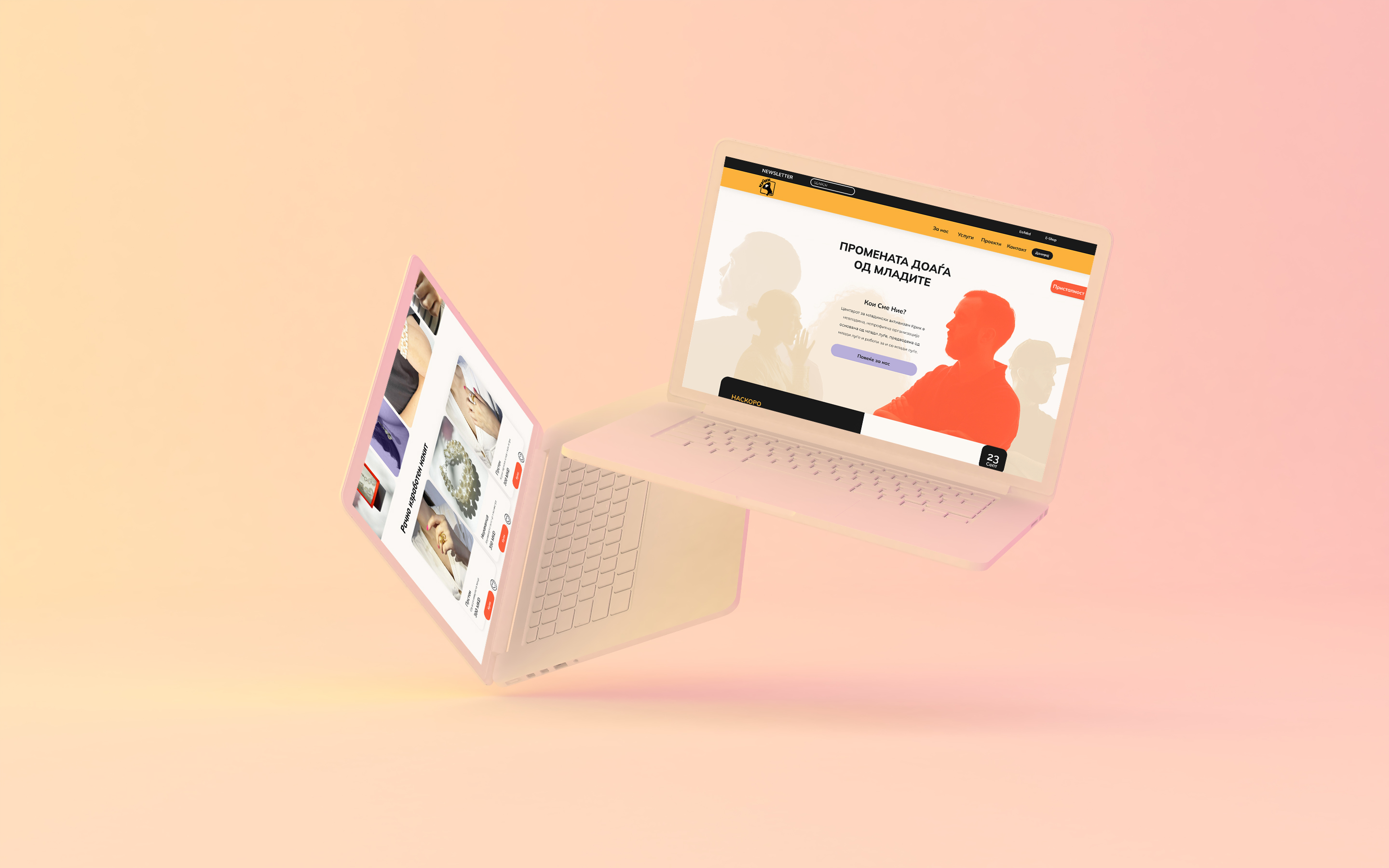
First Project - First Win
The client recognized the potential in our design, and I can proudly say that our team won the challenge! To my mentor and the team — thank you. Your guidance, creativity, and dedication shaped our success. Although faced with a short deadline and no materials to work with, and the fact that it was our first real project, together, we crafted a digital space that would resonate through the online realms, quietly but profoundly.
Chapter 1: A Call from Krik
Krik, a youth-led non-profit, sought a digital space to amplify their message of inclusivity and social change. Their old website had seen better days, compromised by hacking attempts and lack of inclusivity. So, we, the UX/UI students, stepped up to rejuvenate their online presence.
Key Objectives:
1. Revamp Online Presence: Create a dynamic and engaging digital space for Krik.
2. Youth Engagement: Foster greater participation and activism among young individuals.
3. Ensure Accessibility: Develop an easily navigable platform for content management.
4. International Visibility: Enhance Krik’s global presence for broader impact.
5. Implement E-Shop: Introduce a functional online store for handmade products.
6. Newsletter Effectiveness: Maximize visibility and accessibility of the newsletter.
7. Security and Accessibility: Ensure a secure website while catering to diverse impairments.
8. Increased Success Rate: Define success through increased engagement, visibility, and support.
Chapter 2: Navigating the Void
Our first encounter was a blank canvas. The old website was wiped clean, leaving us in the dark. Personally, it stirred a conflict within me — the fear that, without a tangible starting point, our endeavor might crumble before it began.
Chapter 3: Crafting Personas from Narratives
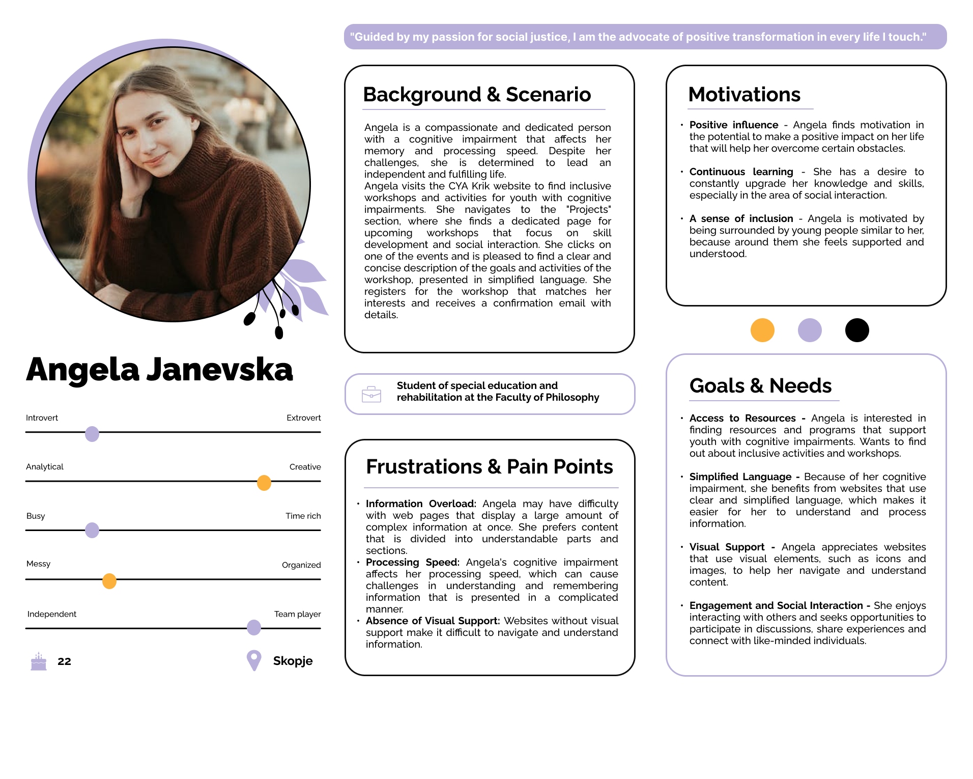
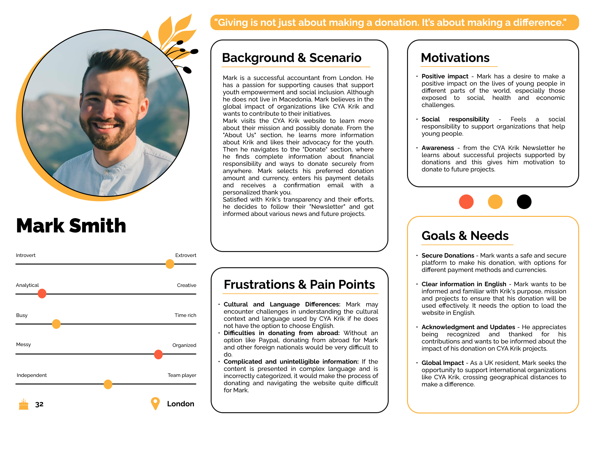
With no visuals to guide us, we turned to the stories Krik shared. Angela, a young girl seeking accessible projects, and Mark, a philanthropist backing youth activism, became our guiding personas. Their stories shaped the canvas for our digital journey.
Chapter 4: Designing for Inclusivity
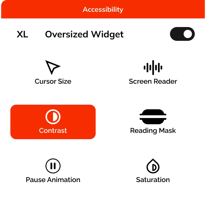
In a world of intricate websites, we envisioned an accessibility menu as the heartbeat of Krik’s new online home. Tools like screen readers, color adjustments, and navigation tutorials became our companions, bridging the gap and creating a digital space for everyone.
Chapter 5: Blueprint and Design Harmony
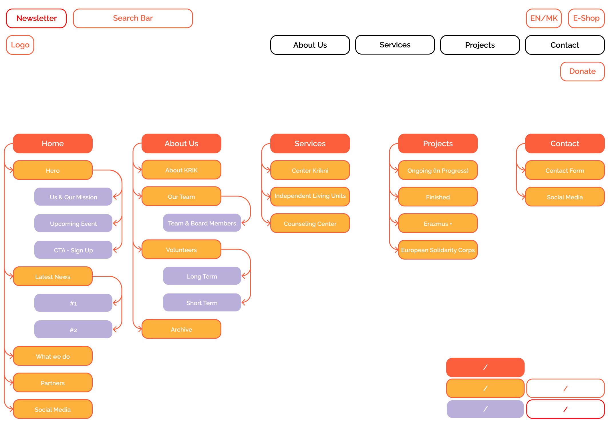
Trying to chart the digital landscape that resonated with everyone, we outlined a site map with five main sections<: Homepage, About Us, Services, Projects, and Contact. We also included donation button and form, as well as E-shop for their handmade jewelry. Our design aimed for functionality with a touch of visual charm — a website that felt like a friendly conversation rather than a tech puzzle.
Chapter 6: Low-Fidelity Wireframes — Sketching the Path
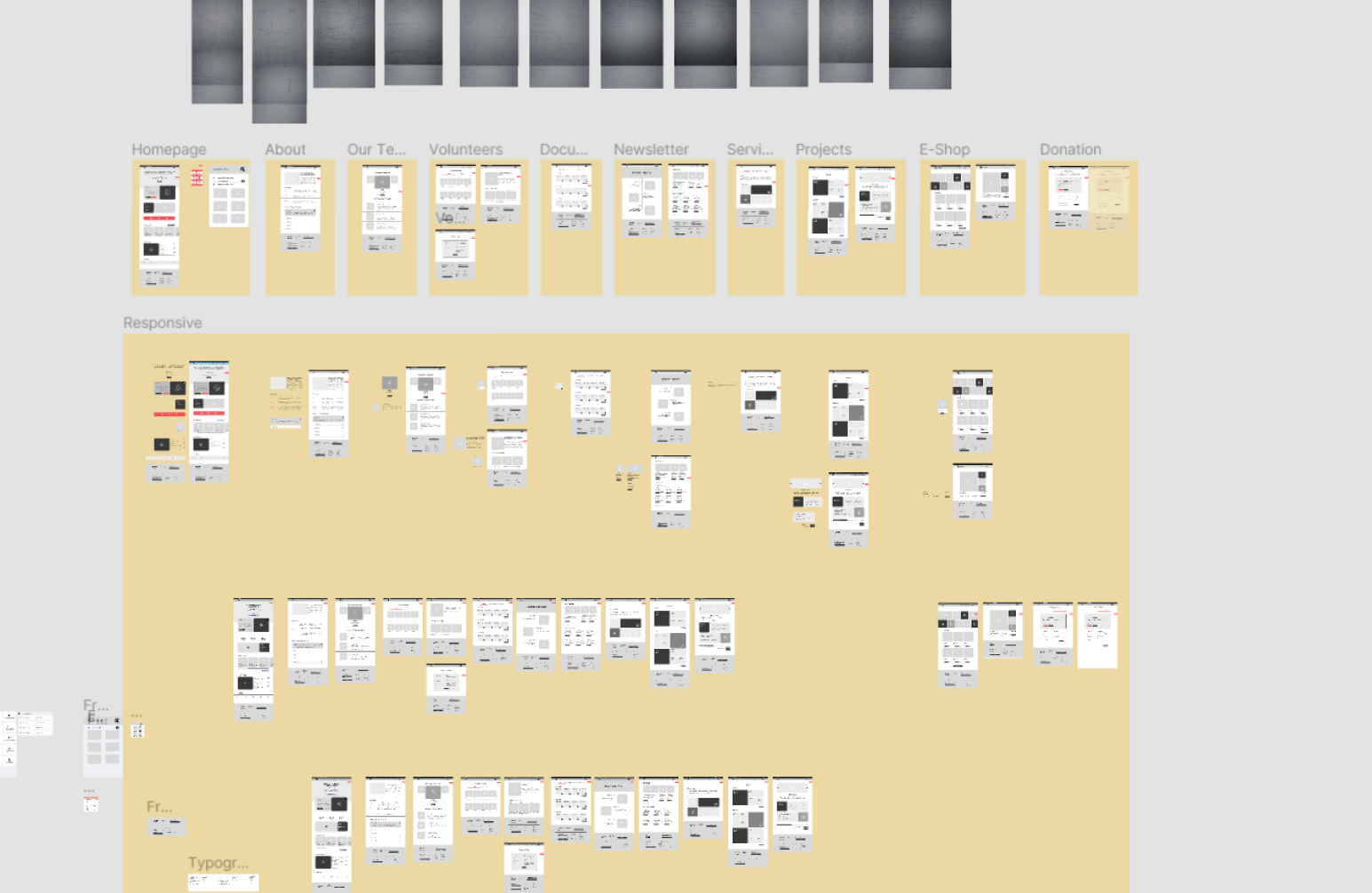
Amidst the sketches and wireframes, my anxiety lingered. The subtle worry that our design might not be inclusive enough gnawed at me. Stepping into uncharted territory, I took charge of low-fidelity wireframes. I paid all my attention to the structure and placement of the elements, so the screens can be as intuitive and inclusive as possible. Analyzing the WCAG guidelines, particularly the POUR principle, helped me immensely in ensuring the website's accessibility. These sketches were the blueprints, a subtle guide to the symphony we were crafting for Krik — a foundation waiting to be brought to life.
Chapter 7: High-Fidelity Wireframes — Breathing Life
Me and my colleagues took those sketches and added depth and life to our digital journey. As the high-fidelity wireframes breathed life into our digital vision, a new fear surfaced — the dread that our creation might fall short of Krik’s expectations. Would it truly capture the essence of their mission? The stakes were high, and uncertainty lingered as the designs transformed from sketches to tangible interfaces.
Chapter 8: Choosing Colors and Typography — A Visual Blend
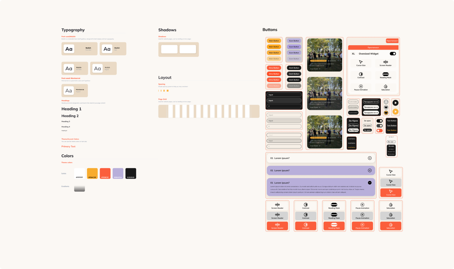
Color palettes and typography choices were made with a careful eye, adding visual charm without overpowering the message. It was about crafting a digital space that felt inviting and approachable.
Chapter 9: Design System — Ensuring Consistency
A design system emerged as the silent conductor, ensuring every element danced in harmony. It was the backbone, quietly guiding the symphony of buttons, images, and text to create a consistent and cohesive user experience. Yet, it was still present — the worry that our efforts might not be enough to bridge the gap for people with disabilities became a driving force. It was a silent battle against the fear that our design might unintentionally exclude.
Chapter 10: The Presentation — Sharing the Vision
As the crescendo built, I had the honor of presenting our digital journey to Krik. Presenting the culmination of our efforts to Krik felt like standing at the edge of uncertainty. At moments, I felt like I couldn’t live up to the role, and that I would let my team down by not delivering the presentation correctly. At moments like those, I reminded myself that one of my greatest strenghts is my way with words, and this is not just presenting a project, it's about telling a whole story.
Luckily, screens lit up, revealing a design that encapsulated the essence of their mission. The accessibility menu, our unassuming hero, took center stage, promising connection and inclusivity.
Against all initial fears and uncertainties, our team’s dedication and collaborative spirit led us to victory, securing the project as the client’s preferred choice among competing teams.
Epilogue: The Ongoing Echo of Krik’s Mission
As we stepped back, Krik’s journey continued to echo through the digital landscape. Our collaboration wasn’t just a project conclusion but a prelude to an ongoing crescendo of youth activism and inclusivity. Each digital note struck would inspire the world to join the chorus of positive change..
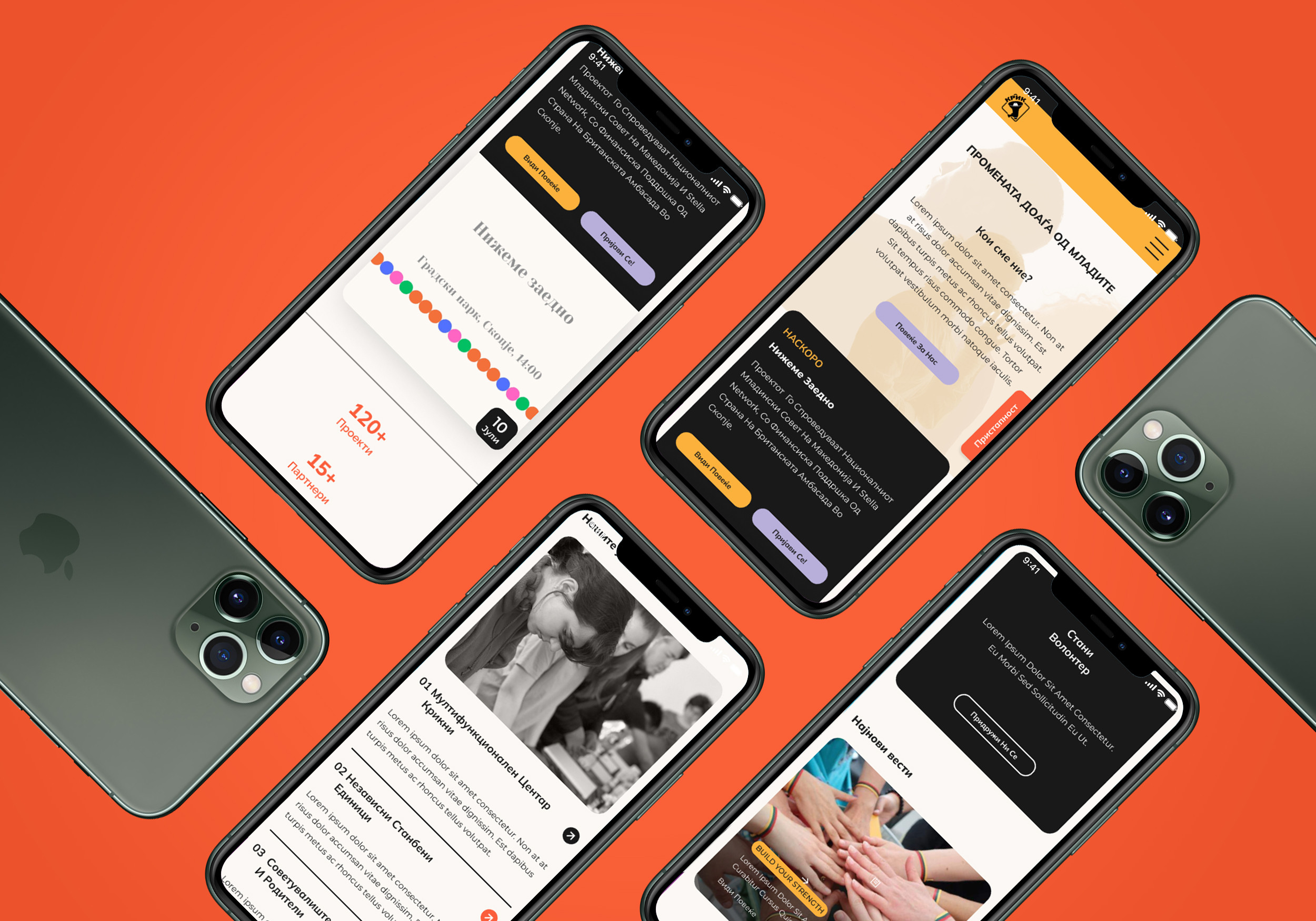
Thank you for scrolling this far! Check out some of my favorite screens in the GIFs below. 🙂⬇
Click here to support my article published on Medium's Bootcamp
