UX/UI Case Study: Elevating Blue House - A Digital Redesign for a Luxurious Stay
Blue House, a charming Bed & Breakfast located in Reykjavik, Iceland, has been a go-to destination for travelers seeking an authentic and luxurious experience, complete with stunning views of the Northern Lights. While the existing website effectively captured the essence of the brand, our team at Siciliamia was brought in to modernize the digital experience. The goal was to refine the website’s usability across all devices, enhance user engagement, and ensure that every touchpoint reflected Blue House’s minimalistic and high-end aesthetic. Over several months, I led a team of four UX/UI designers in tackling this project, focusing on maintaining the brand’s integrity while introducing creative solutions to improve functionality and user satisfaction.
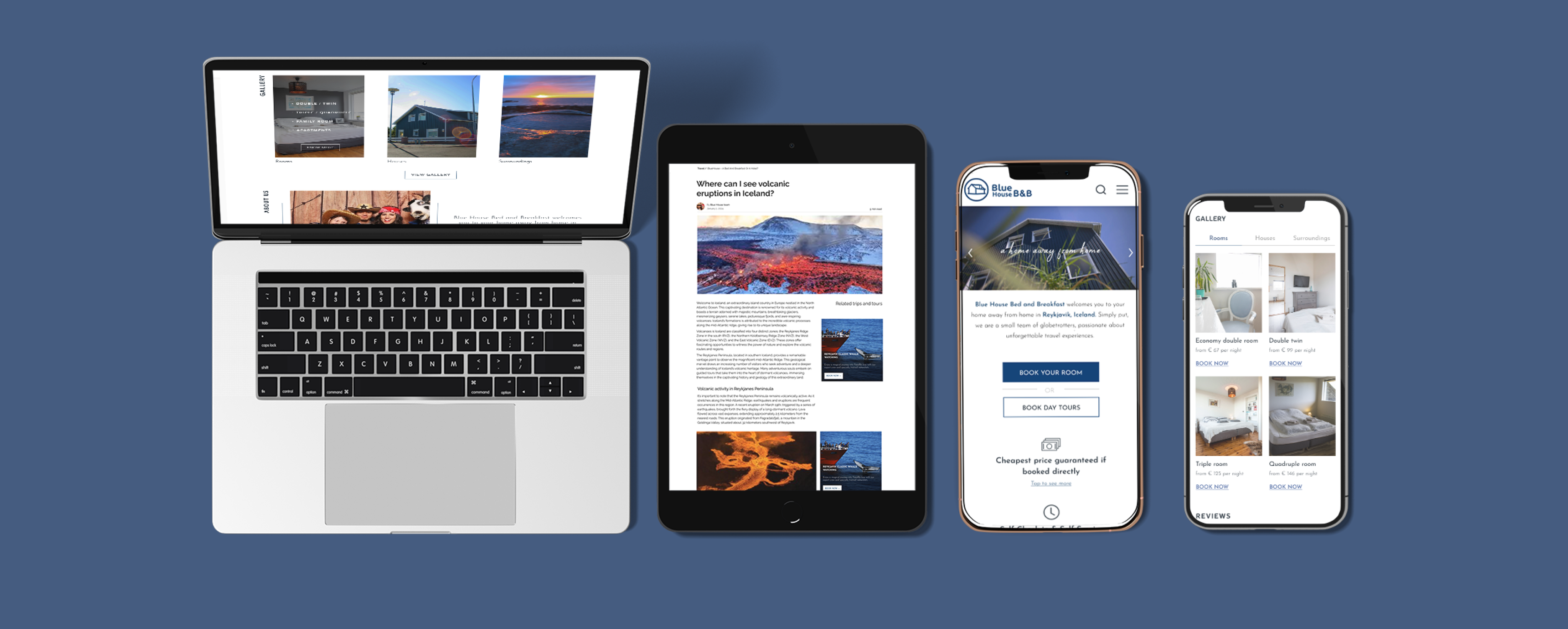
Role: UX/UI Designer and Team Leader
Timeframe: October 2023 to February 2024
Company: Siciliamia
From Insight to Impact
Our project thrived on a collaborative spirit and strong communication. Leading a team of four, I ensured open dialogue with the CEO, whose feedback was crucial to our iterative process. Each round of refinements brought us closer to a design that truly resonated with him. As we finalize the implementation, we eagerly await user feedback to see the impact of our enhancements on engagement and satisfaction.
Key Objectives:
1. Enhance Desktop Experience: Identify and correct design misalignments, improve the design system, and ensure a cohesive layout.
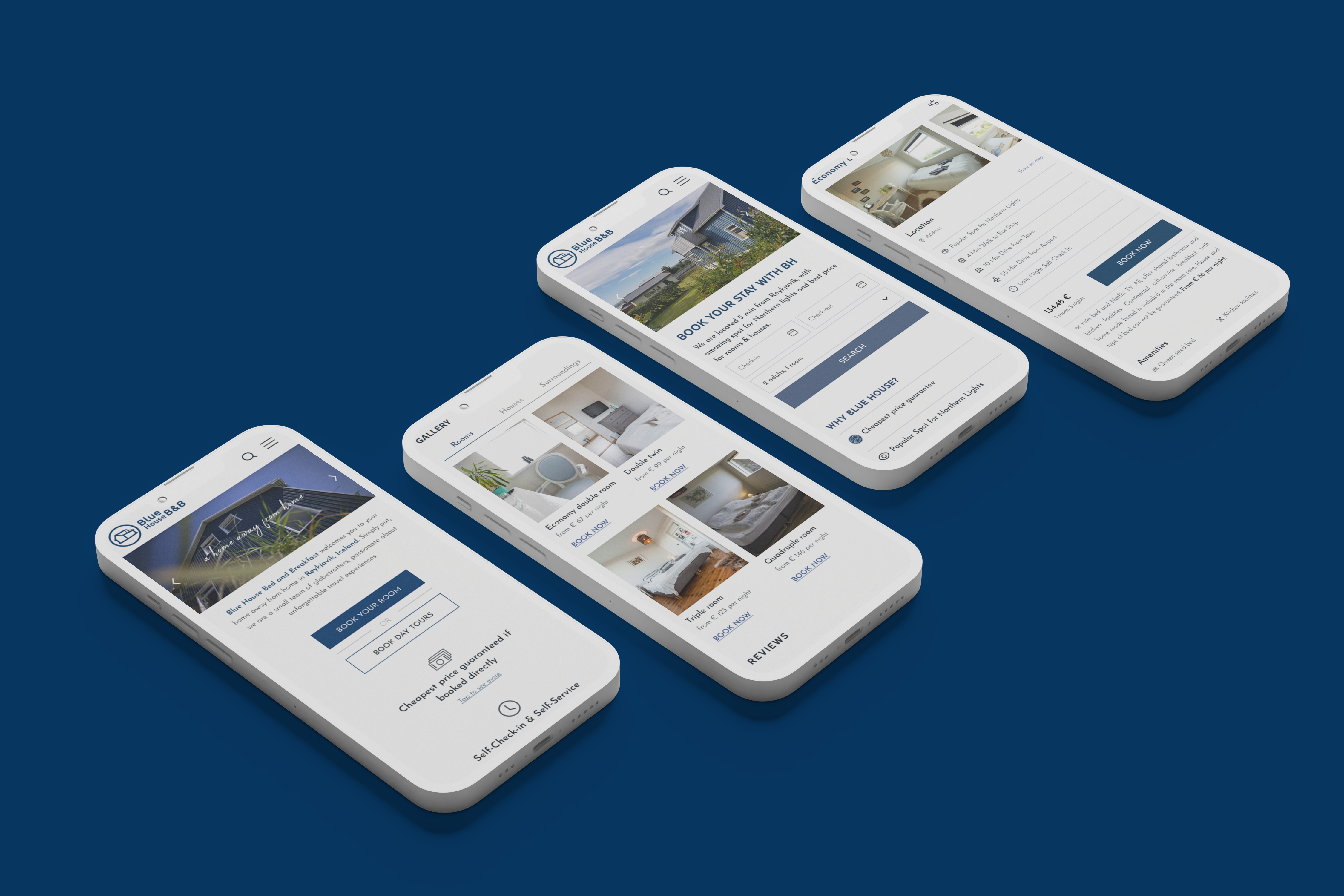
2. Redesign Mobile Experience: Create a user-centric mobile version focusing on intuitive navigation and streamlined booking processes.
3. Revamp Booking Section: Adapt the third-party booking system to align with Blue House’s branding and improve user experience.
4. Overhaul Help Center: Transform the help center to match the website’s aesthetics and enhance user support functionality.
5. Redesign Blog: Improve the blog’s usability, content organization, and SEO performance to increase user engagement.
Desktop Version Enhancements
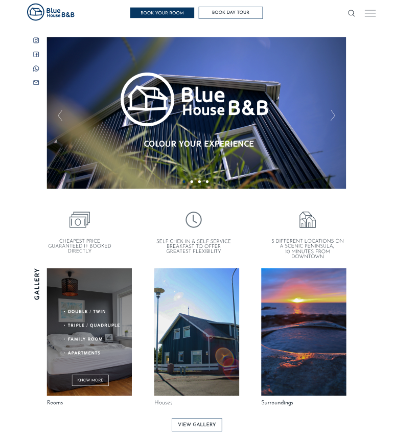
To refine the desktop experience, we first pinpointed and addressed design misalignments.
-Research and Testing: Conducted thorough analysis to identify problematic areas and testing to confirm them.
-Redesign and Implementation: Redesigned specific website sections, ensuring they blended seamlessly with the overall layout. Collaborated with engineers for smooth integration.
-Design System Overhaul: Organized and improved the design system, defining main components and variants for future use.
-File Organization: Streamlined the Figma file for better accessibility and usability in future projects.
Mobile Version Redesign
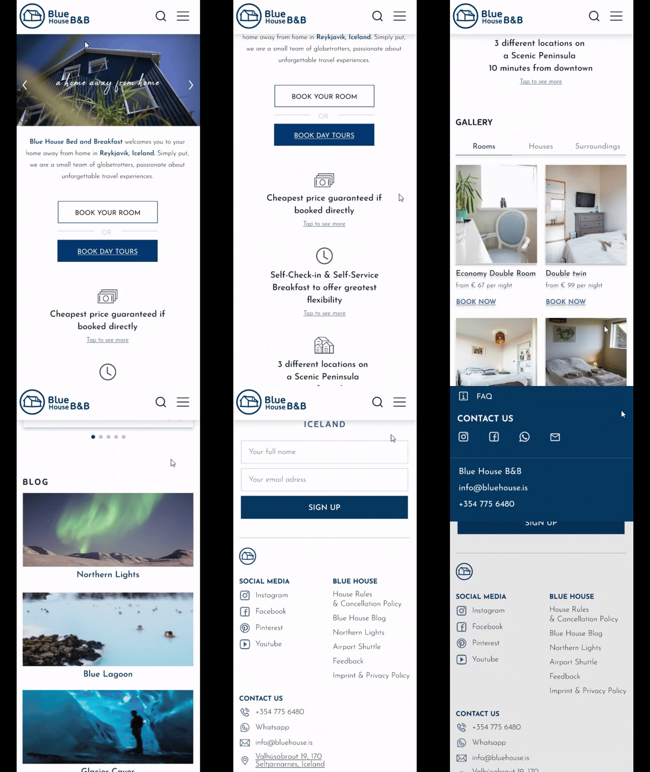
A deep dive into analytics highlighted significant issues with user engagement on the mobile site, prompting a full redesign.
-Traffic Analysis: Worked with the SEO and analytics team, utilizing tools like Google Analytics and Page Sense to track user behavior.
-User-Centered Redesign: Focused on making the mobile version more intuitive, especially for last-minute bookers. Conducted extensive research, ideation, and meetings with key stakeholders. Then, we created user personas based on the client's input and the user's perspective and research to help us figure out which aspects of the website and booking process are the most important for last-minute bookers.
-Streamlined Booking Process: Designed with the goal of enabling users to book a stay with minimal clicks.
-Collaboration and Approval: Collaborated closely with the CEO, SEO team, and developers to ensure the design met all requirements. The new design was approved and is now in the implementation phase.
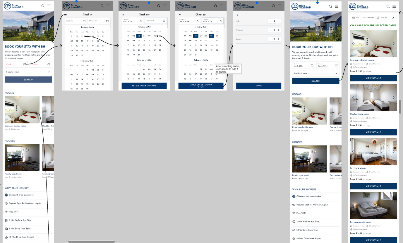
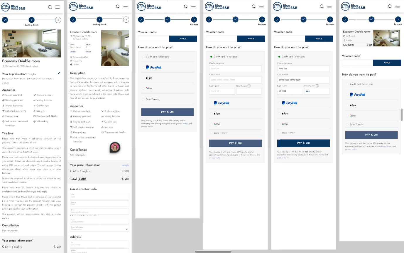
Booking Section Redesign
We faced the challenge of redesigning a third-party booking system to match Blue House’s branding. We were very limited with the customization options, but we still managed to make the booking process seamless, intuitive and to match the Blue House brand essence.
-Visual Consistency: Adapted the third-party system to align visually with the main website, overcoming code limitations.
-Seamless Experience: Ensured the booking section maintained branding consistency and improved user experience.
-Implementation Phase: The redesigned booking section is currently being implemented.
Help Center Revamp
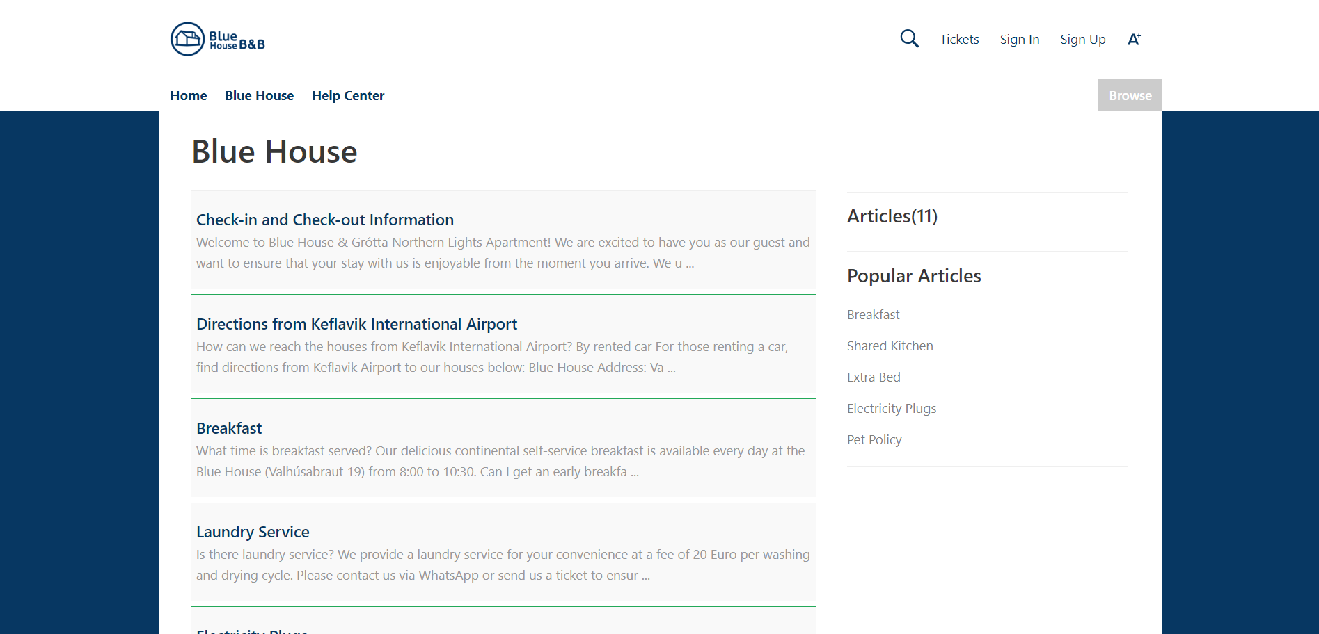
The help center, hosted on Zoho Desk, required a design overhaul to better fit Blue House’s aesthetics.
-Template Adaption: Worked within the constraints of limited templates to create a cohesive look.
-Enhanced User Support: Overcame design limitations to optimize the help center’s functionality.
-Live and Functional: The revamped help center is now live and offering an improved support experience.
Blog Overhaul
The Blue House Blog needed significant improvements in usability and content organization to enhance engagement and SEO performance.
-Content Organization: Reworked the layout and categorization of articles for better user experience.
-SEO Collaboration: Partnered with the SEO team to make articles more readable and engaging.
-New Layouts and Features: Designed new article and tour guide layouts, added intuitive categories, and improved search functionality with tags.
-Awaiting Implementation: The blog redesign is pending implementation, with plans to monitor user feedback for effectiveness.

Summary
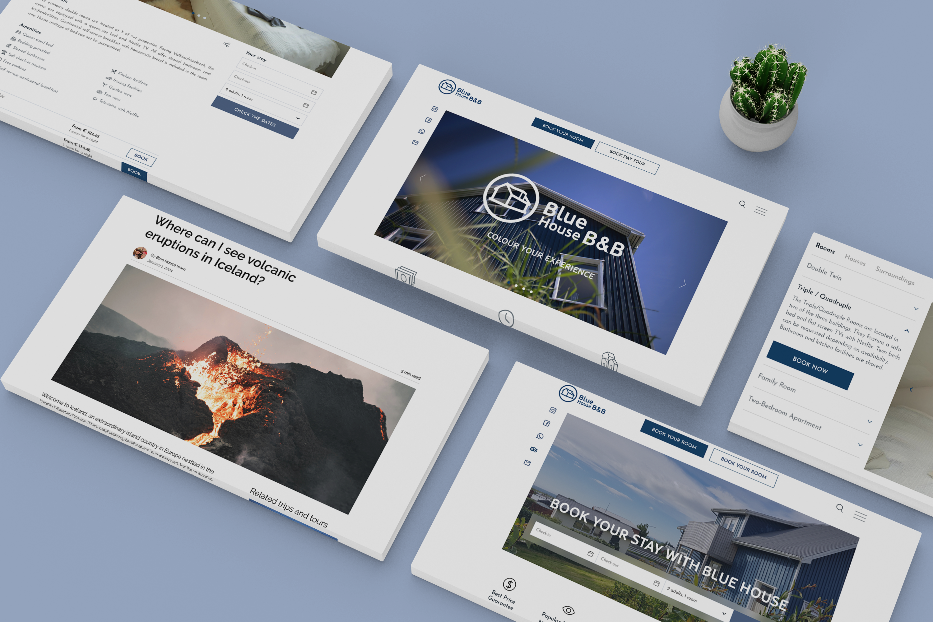
Our project at Blue House involved a comprehensive website redesign, enhancing both desktop and mobile experiences, refining the booking section, revamping the help center, and overhauling the blog. Through meticulous research, testing, and collaboration, we ensured the new designs are user-friendly, visually appealing, and true to Blue House’s brand. We eagerly await the positive impact on user retention and engagement post-implementation.
Thank you for scrolling this far! Check out my other case studies ↓